Interior colour trends – they’re the most hotly debated topics when it comes to home design and, with a new season, comes a new conversation about the colours that are on the must-use list in the year to come.
So, who decides on the ‘in’ shades? WGSN is a global forecaster of all things colour; seeking out the palettes that are reflective of lifestyles globally. Its Colour Strategist, Clare Smith, says of 2024: ‘Colours that connect to nature remain key, with these restorative shades bringing a sense of calm and tranquility to the season.’ It also predicts that Intense Rust, Midnight Plum, Sustained Grey and Apricot Crush are the looks that will be influencing the way we design, dress and decorate this year and beyond. On the blue front, Blue Nova 825 by Benjamin Moore, a sumptuous new mid tone blue has quickly become a stylist’s go-to colour of the year.
While Apricot Crush isn’t everyone’s cup of tea, embracing a palette of hues that have been perfected by Mother Nature is. Nature rarely gets it wrong. From light browns to soft blues, and from rich reds to crisp greens, such as Ashfield Shamrock (shown), you’ll be sure of reassuring, enveloping looks that feel right for the time and place you live in.
Here we give you an interior designer masterclass in the nature-inspired hues of the moment that, we predict, will also stand the test of time…
Brown: the new grey
For several years, grey has been hailed as the go-to neutral. While it still has its place, as WGSN confirms, it also has one big downside in home decoration. Thanks to the UK’s low seasonal light levels, it can appear way too cool; making rooms feel apathetic, even chilly, to live in. That’s why warm and sophisticated light brown has been quietly creeping onto the neutral lover’s wish list. By nature, its earthy constitution makes for a reassuring and grounded backdrop.
Look to light browns, such as sand and blonde, as your starting point on walls and hard surfaces – either with a matt paint or perhaps a plain-woven wallpaper for texture. If that’s too much for you, highlight woodwork such as doors, door trims, skirtings and dados with an eggshell paint for depth and interest against warm white walls.
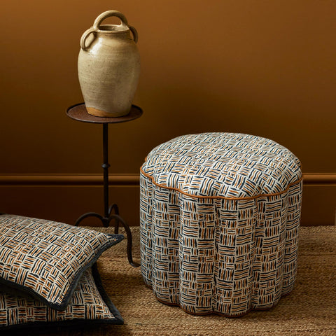
Introducing rhythmic patterns in harmonious shades is important in this kind of scheme, so seek out characterful small print linens, such as Trapeze Lombok (shown) to complement. With its chocolate and caramel basket weave design, it brings a dash of dynamism to drapes, cushions and upholstery.
Refined simplicity: mushroom and warm beige
The refined simplicity of understated, elegant neutrals continue as an enduring trend in 2024. Warm neutrals are the perennial backbone of a relaxed modern country room scheme. Yet this year’s penchant for grown-up, pared-back interiors, sees the colourway paired with dark organic browns – think mushroom and espresso. The result? A naturally tailored design approach that feels more City than Cotswolds.
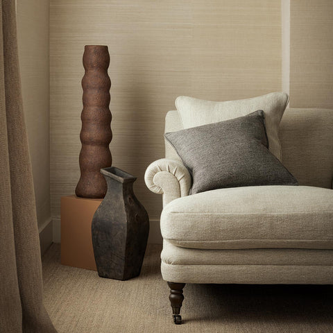
Linen fabric is the go-to textile for this minimaluxe look. Known for its woven structure and rich texture, consider the perfect pairing of Orta Linen accented with Orta Mushroom (shown). These heavyweight semi plains are perfect for upholstering sink-into sofas and neat armchairs for hardwearing and good-looking seating. The slubby handle also makes it a good choice for fulsome, interlined drapes that puddle pleasingly onto the ground. Dark wood furniture, woven flooring, leather detailing and sculptural ceramics make foolproof companions to bring this handsome scheme together.
Soothing hues: soft blue and jade
Many of us are in search of decorating ideas that will bring flowing and calming energy to a room. That’s why there’s a lot of talk about the stunning shades of blue and green in 2024. Both colours sit adjacent to each other on the colour wheel, making them an analogous combination that (in theory and real life) really works, especially when grounded by a crisp white or a pale neutral.
Jade is the intense green from the gem world. When combined with a soothing light blue, such as Valspar’s restful Renew Blue (another colour of the year), it creates a watery medley that is easy to decorate with and easy on the eye.
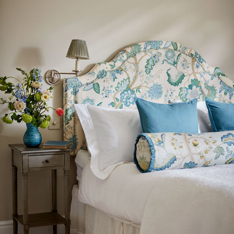
Bedrooms with a sunny outlook make the perfect home for this versatile combination as shown here on the timeless tree of life design, Kitty Blue Green. With its large-scale trail of stylised leaves and flowers, it looks exquisite on shapely upholstered headboards accented by a glamorous bolster cushion. In light and airy living rooms, consider the fabric as a statement on a sofa or window treatments. Then tease out the colours onto cushions, lampshades and rugs.
Warm and rich: burgundy and rust
Never underplay the power of the warm colour scale. Dark reds and earthy oranges are two colour groups that pop in and out of the trends’ lists, but in reality, are always a reliable choice for elegant and snug schemes.
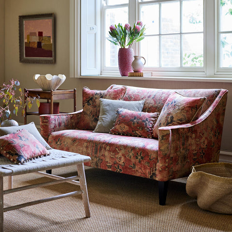
This year, it’s all about antiqued and aged burgundy, berry and terracotta shades. These colour reincarnations take their cues from country house vintage rugs that have been worn well with time. Feel inspired by Hali Ruby (shown), a distressed-style velvet fabric that mirrors the proportions and designs of an ancient kilim, or the inviting Samimi Earth with its bazaar-style design. For a quieter melange, try Hayali Garnet.
These affirming colourways tend to feel at home in period properties where their authenticity works in harmony with the historical architecture, whether that’s original wooden beams, doors and floors or elegantly proportioned windows. Choose upholstered furniture designed with modern clean lines as a counterpoint to intricate patterns. Balance the scheme further by taking it down a notch. Timeless woven textures in the form of natural flooring and handwoven basketry are the perfect levellers.
The versatility of pink: from light to dark
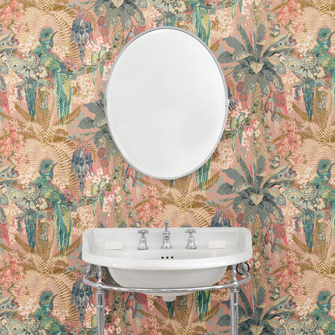
The beauty of pink is in its versatility. The pink, “Peach fuzz”, was declared its colour of the year for 2024 by Pantone. It's a warm, blush shade that brings with it a feeling of sanctuary, describes the colour forecaster. These kinds of subtle and sensual pinks make good grounds for walls. Explore wallpapers with flamboyant or quiet patterning depending on the mood you are after. Bamboo Garden Dusky Pink (shown), for instance, is layered with a faded palette of tropical floral blossoms intertwined with bamboo, it has a days-gone-by exotic mood well suited to bedrooms and bathrooms.
At the other end of the scale, high energy fuchsia, magenta and candy pinks have their place in making bold statements in living spaces. While we wouldn’t recommend going crazy with these shades, jazzy patterns on dazzling velvets, such as Casper Berry, are real head-turners when used on upholstery. These exuberant pinks also make good plain accents, so if you love them but are a bit afraid to use them, then a small shot of, say, a cushion, an upholstered pouffe or a little occasional chair works every time.
The rise of greens: chartreuse, pistachio and forest green
Botanical greens are so easy to love. Connecting us to the landscape, they are instinctive choices for interior design projects in 2024. This season, zippy chartreuse green introduces itself into interiors as a sprightly and youthful shade that will blow a breath of new thinking into downstairs rooms, such as kitchen diners or rooms that lead onto gardens. Use them on small print designs (we love Hopscotch Frog) in defined areas like Roman blind, a window seat or a carefully placed cushion.
Nutty green shades, such as pistachio, bring a new edge to the pastel cohort. Stripe, trellis or trail interpretations, on both fabric and wallpaper, keep this colour in check and will negate its sickly reputation. Heading deeper down the colour path, explore the moody greens associated with the evergreen forest. These iterations will hug your room – especially if it is naturally dark – and pair beautifully with a soft black shade, as shown by Helter Skelter Sage. A deep olive shade is also an option.
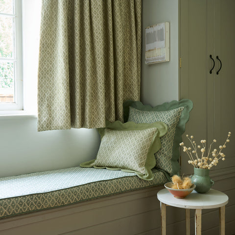
Always remember to balance green patterns with a good dose of plains (as shown here) by combining Ashfield Dewdrop curtain and cushion with Juno Oregano as a scallop-edge cushion trim.
Incorporating 2024’s colour trends into your home
Experimenting with the latest colours of the year gives you free rein to change the aesthetic of your home. It’s a creative process that may involve a total room redecoration or a simple restyle to existing decor. Follow these simple design tips to get started:
-
Research and visualise how you want a room to look by creating a moodboard around your favourite trend colour. This should include all the key elements in the room: paint, wallpaper, fabric, flooring, textures.
-
Consider the orientation and light levels in the room. North-facing rooms get little natural light and will benefit from warmer colours, while south-facing rooms that enjoy considerable warm light can take cooler colours.
-
Shortlist the key elements on which to introduce your chosen colour. It could be a rug, an upholstered sofa, an accent wall.
-
Balance this with ‘secondary’ and ‘third’ colours that complement and enhance.
-
Repeat your chosen colour on small and budget-friendly accessories across the space, such as decorative ceramics, lamp bases, even tableware.
Staying abreast of interior colour trends is an inspirational and enlightening way to refresh your decor. A colour of the moment lets you reconsider new and exciting ways to revitalise spaces and make them unique to you. Explore combinations by ordering free fabric and wallpaper samples, playing with tester pots and bookmarking favourite seasonal accessories before making the commitment. Happy colouring!

